As you all likely know from this site, Nintendo’s games always leave a ton of interesting concepts over on the cutting room floor. Whether it’s Breath of the Wild’s unused Divine Beast and Guardian designs, Super Mario Odyssey’s scrapped kingdom and NPC designs or the hundreds of cut Pokemon from the Spaceworld demo, their games have loads of great ideas that never made it into the final game for one reason or another.
Luigi’s Mansion 3 is no exception. Indeed, with a development cycle spanning two console generations and numerous revisions of the core concept, the game almost certainly has all manner of unused ideas lying around that never made the final game.
And now thanks to the art viewer, we can now see a few of them for ourselves. So in this article, I’m going through the interesting ones, and speculate on how they originally altered the look and feel of the game.
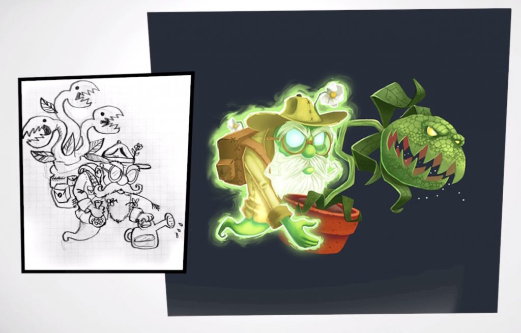
5. Dr Potter’s Three Headed Plant
Starting with an interesting change in the design for Dr Potter. Namely, he was going to fight with a three headed Venus fly trap at one point in development.
This presumably would have made the fight a bit trickier overall, since the plant would now be able to attack from multiple directions at once, as well as potentially throw Luigi around like a pinball on top of that.
It’s unknown whether this would have been the case early on or whether the plant would grow multiple heads every time the boss took damage, but regardless, it’s clear the battle was originally going to be a fair bit tougher than it is now.
This may or may not have been a good thing given the reactions many players had to the boss battle in the final game, or the randomness involved in whether Potter will ever be left vulnerable to your attacks.
Either way, it was clearly cut out early on, and the one headed Venus fly trap remained the only variation used in the boss battle.
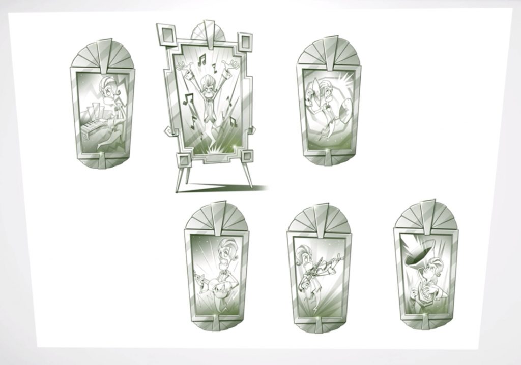
4. Amadeus Wolfgeist’s Many Musical Talents
Speaking off boss ghost changes, it seems Amadeus Wolfgeist may have gone through a few minor changes in development too. That’s because in the gallery for the Great Stage, you can find this amusing image of him playing a wide assortment of instruments rather than just the piano:
It’s a neat image, though it makes us wonder what the actual plan might have been here. Would Amadeus have played different instruments throughout the stage as a way to fight Luigi? Could they have all somehow factored into the boss battle with him?
Or were the images just planned for the paintings you see in the foyer instead? Perhaps instead of evil instruments with glaring eyes and pointy teeth, you’d be greeted with pictures of Amadeus playing them in various comical poses instead. Or statues showing the same.
Regardless, they’re nowhere to be found in the final game, so we can do nothing but speculate right now.
3. The Foyer’s Interior Designs
Still, enough with the boss ghosts for the time being. Instead, let’s look at a few neat unused designs for the hotel itself.
Since just like with the boss ghosts, the art gallery contains a fair few concepts for both individual floors and the Last Resort as a whole.
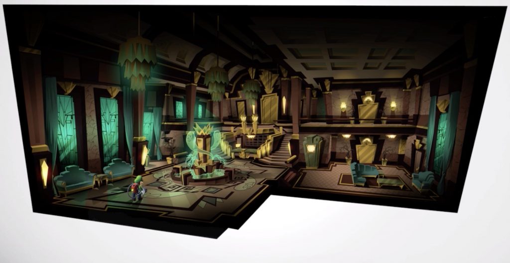
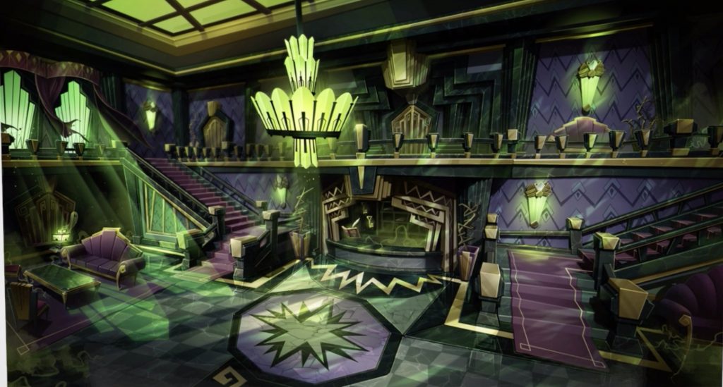
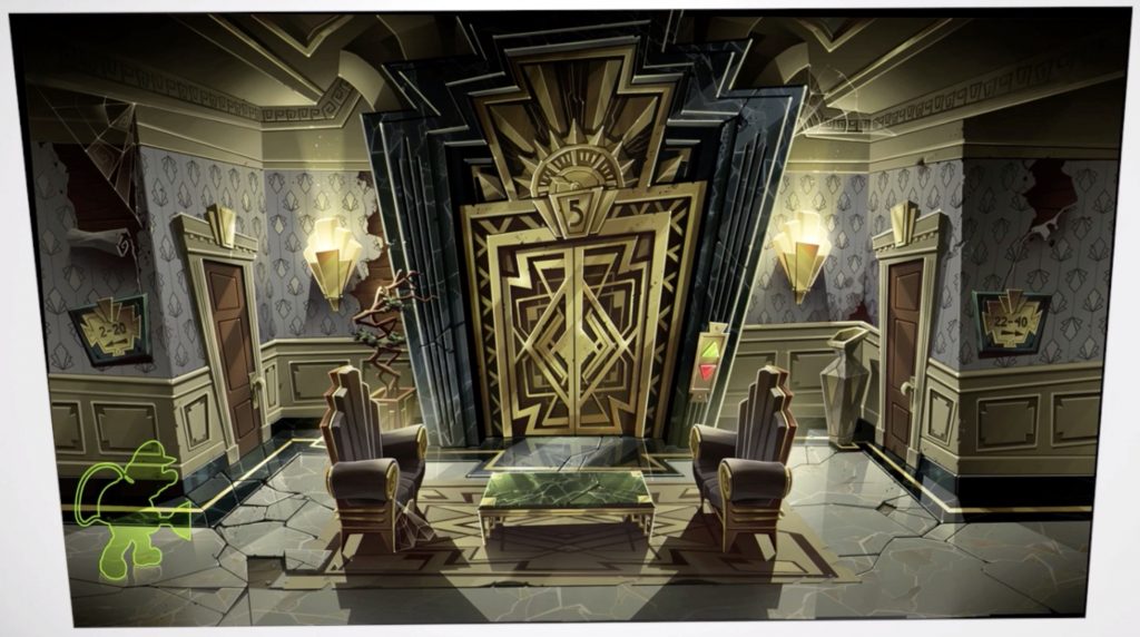
Such as the Foyer, which has two entirely unused designs sketched out for it.
Both of which are incredibly interesting in themselves. The first one looks a lot like the finished one, albeit with a much more prominent ghost statue/fountain in the centre:
Whereas the second one looks absolutely nothing like anything seen in the final game. Instead, it reminds us more of Bowser’s Castle from Mario Kart 7 over anything else, with the same sickly shade of green used for the light pouring through the windows:
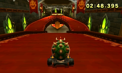
Here’s the hallway from Bowser’s Castle in Mario Kart 7 to compare
They’re both fantastic designs overall, and ones that could have easily worked in the final game had NLG gone that direction.
2. 40 Rooms in the RIP Suites
However, that might not be the case for the next item on the list. Why? Because the artwork for RIP Suites shows the area was going to be significantly bigger at one point in the game’s development:
As you can see, the floor originally had 40 rooms. No, you’re not reading that wrong. 40. As in, the amount a large hotel might actually have on a single floor in real life.
That’s massive, especially compared to the 8 rooms we actually got in the final game.
In fact, it’s so big that had this been true of RIP Suites in the final game, it would have become one of (or even the biggest) floor in the entire hotel. 40 rooms would genuinely put it beyond the likes of Twisted Suites or Tomb Suites in terms of scale, and make every other area in the final game look utterly puny by comparison.
But that may not have worked well overall. Indeed, if RIP Suites alone was 40 floors, it’d be an absolute chore to navigate, let alone track down all the money in gems in.
And if other floors were as equally massive, well the game might have been too difficult in its entirety. Stuff like Tomb Suites is already pushing it when it comes to how far you can stretch the Luigi’s Mansion formula for a single area, so having every floor be twice that size or more would be utterly ridiculous.
So despite everyone’s hopes for more Luigi’s Mansion, I think it’s probably a good thing that individual floors weren’t quite as big as RIP Suites was planned to be in this concept art.
1. An Amusement Park? In a Hotel?
But RIP Suite’s scale wasn’t the only major design change shown in the concept art. No, quite a few unused floor designs and story changes can be seen in the art gallery too..
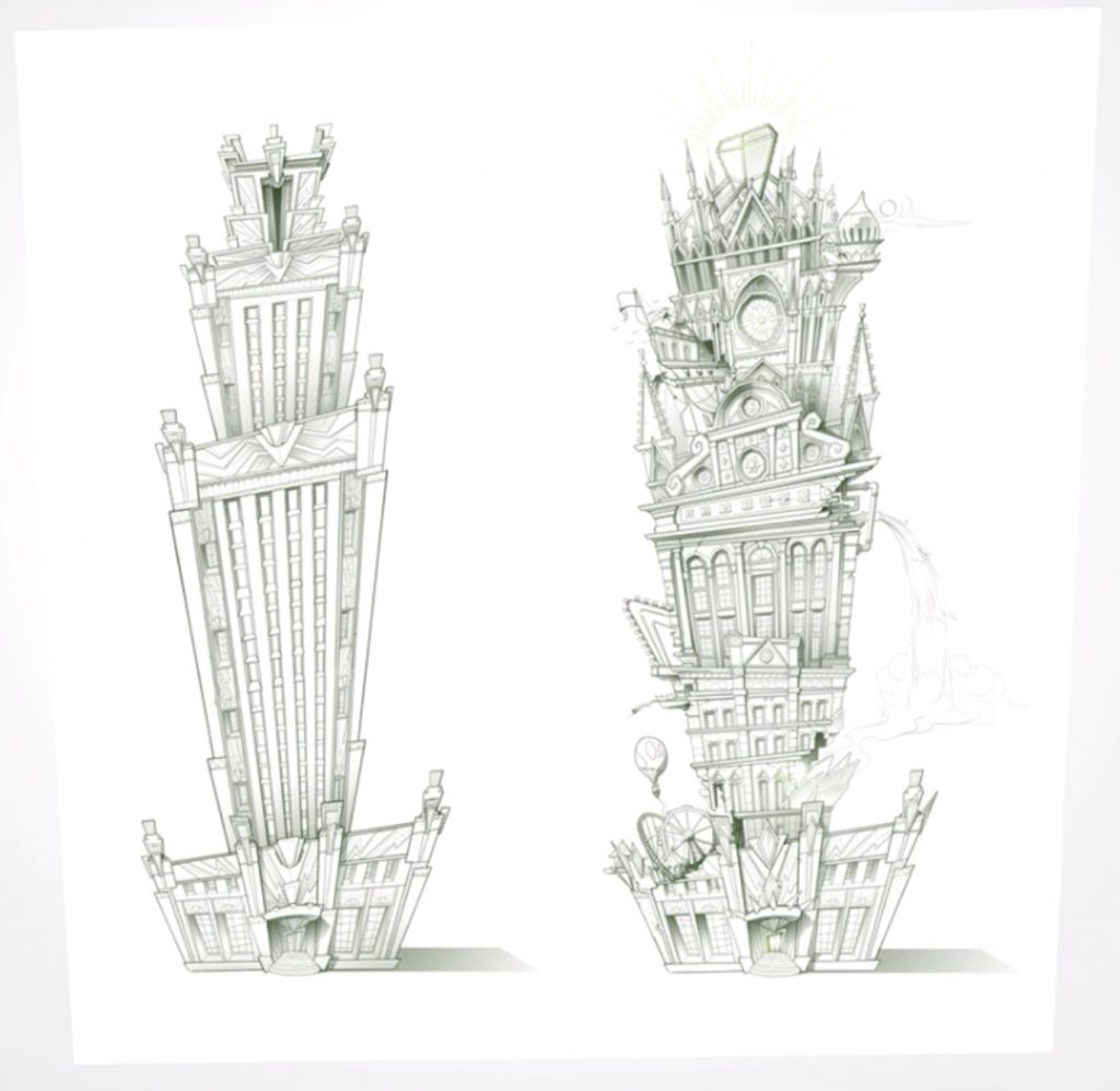
Like the ones in this picture:
Which shows a version of the Last Resort that’s worlds apart from the one in the finished game. It’s got floors from the final game in different places, bits of architecture that don’t correlate to anything in the game, and elements that indicate some whole floors weren’t thought up this early in development. Like the Dance Hall, which was clearly not intended to be floor 14 at this point in development.
Or perhaps the giant hole in the side of the building, which looks like it was made with Neo Bowser Castle in Mario & Luigi Paper Jam:

Caption: What else could leave such a large hole in the side of the building?
Yet the most interesting change you can spot there isn’t either of those things.
It’s the theme park that’s found on the 1st floor. Yep, it seems an entire theme park was planned as a floor at one point in development, with stereotypical attractions like a ferris wheel and rollercoaster playing a part as attractions.
That’s pretty crazy for a hotel floor, even for a place as absolutely bizarre as the Last Resort.
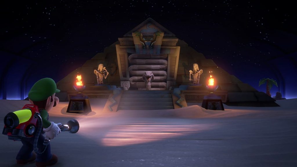
Though to be fair, a pyramid is an unlikely hotel attraction too
But it’s the kind of crazy I like to see in Nintendo games, and a theme I definitely wished NLG would have kept in the game. Here’s hoping they revisit it in the future, either as DLC for this game or part of Luigi’s Mansion 4 for the Switch’s successor.
So that concludes the list. Hopefully you found it an interesting look at some of the planned ideas that never made it into Luigi’s Mansion 3, and I definitely recommend you check out the art viewer yourself for even more neat bits of concept art if you haven’t done so already.
And if you’ve got any thoughts on anything here, post it in the comments below, on the Gaming Latest forums or on our Discord server today!
