Well folks, it’s here! After plenty of excitement and marketing on Nintendo’s part, the Tears of the Kingdom Master Works book is now available in Japan.
あさって8月30日(金)に、公式設定資料集「ゼルダの伝説 ティアーズ オブ ザ キングダム マスターワークス」が発売されます。書籍を編集されたアンビットさんより、本書を紹介する映像が公開されましたので、よろしければご覧ください。#ゼルダの伝説 #TearsOfTheKingdomhttps://t.co/8qDSEMzRcP pic.twitter.com/Gbce96KQgL
— ゼルダの伝説 (@ZeldaOfficialJP) August 28, 2024
And along with it, we get to see all things that didn’t make the cut. From dungeon designs to character concepts, backstory to lore, there are all manner of interesting things described here that aren’t present in the final game.
So today, we’re gonna look at some of this stuff, and learn all kinds of fascinating new things about the game’s development. Let’s get started!
First though, here’s the article in video form, if you prefer that:

Alternate Light Dragon Designs
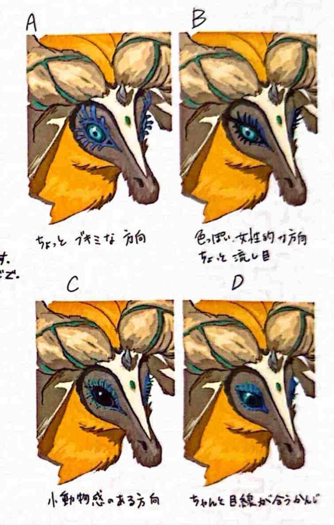
With our first topic of the article being alternate Light Dragon designs, since Zelda’s unused hairstyles have been done to death already. Either way, there are a few of these unused Light Dragon concepts in the book, with many of them have a much closer resemblance to Zelda than the final one.
But they were all cut for the same reason:
The developers didn’t want it to be too obvious that the Light Dragon was a transformed Zelda. Yes, they wanted players to be able to figure it out, especially if they paid attention to the story…
But they didn’t want it to be too obvious here. So, any Light Dragon designs with Zelda style hair curls and facial features got the cut.
A Very Different Construct
Enough about the Light Dragon now though, onto another relic from the era of Hyrule’s founding.
Mineru’s Construct.
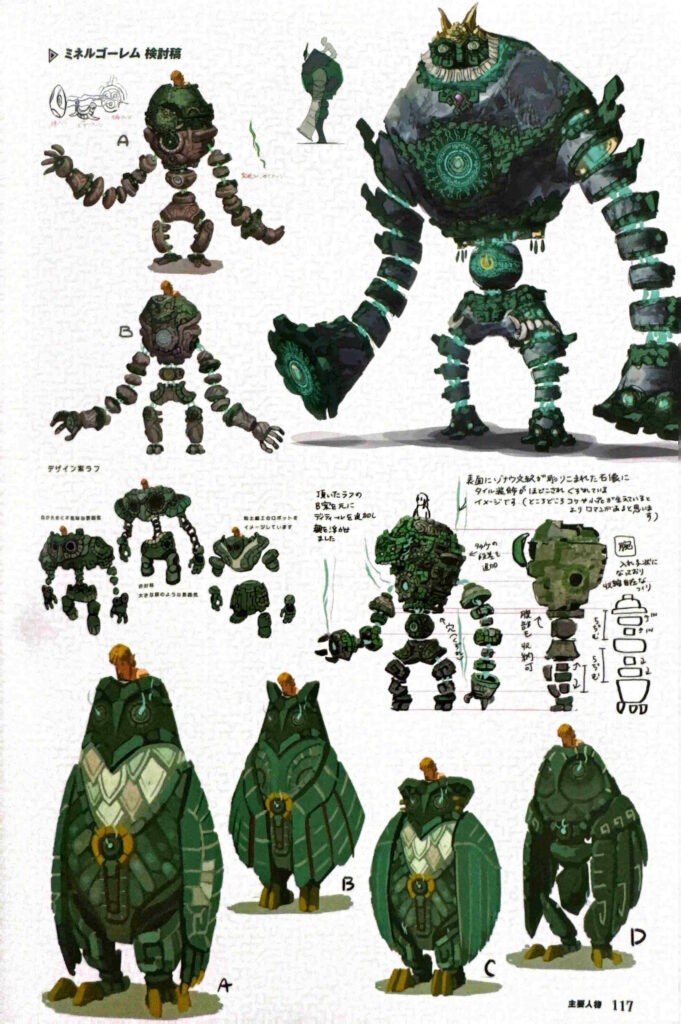
This looked very different in the concept art for the game. Indeed, while the final version looked like a humanoid mech in the general shape of a golem…
The early concepts for it were all over the place. You’ve got a stone plant covered golem straight out of ancient mythology, an ominous green one with cannon-like hands and even what looks like a giant robot owl:
Yes, the devs actually floated the idea of Link riding a giant mechanical owl around Hyrule.
It’s goofy as all hell, and honestly looks absolutely ridiculous, but we really wanna see what it’d have been like in game now.
Here’s hoping someone actually mods it into the game at some point!
Yunobo’s Bizarre Fashion Sense
But Mineru wasn’t the only sage to get a redesign or three. No, Yunobo had a few intriguing concepts created too.
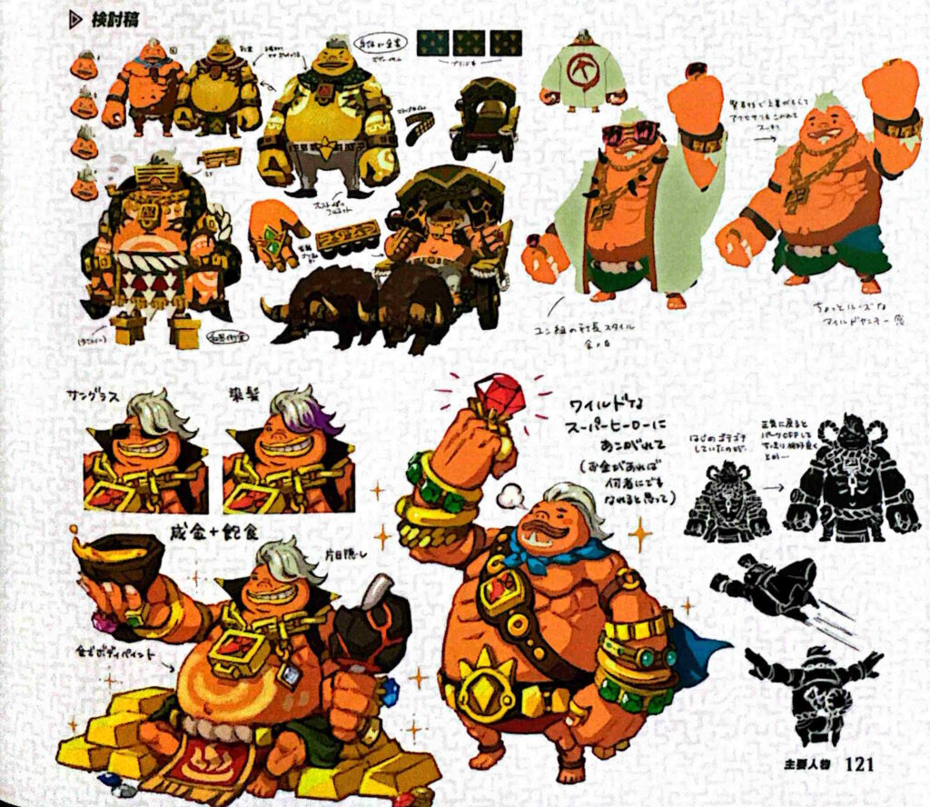
Namely, ones for his brainwashed ‘pimp’ design.
And these just range from goofy to downright hilarious. You’ve got Yunobo the Goron King, sitting on a big pile of gold bars drinking to his success, Yunobo riding in a Dondon driven carriage like a royal on a world tour and Yunobo in his goofiest design yet (middle left):
Yeah… it’s Yunobo blinged up to the heavens, complete with a giant visor and platform shoes. He looks utterly ridiculous, and we honestly kinda love it.
But it’s pretty obvious why the design never made the cut. After all, can you even imagine trying to animate a boss battle with this character concept?
Yeah, it probably wouldn’t work well. Yunobo’s attack pattern doesn’t really go well with high heels, at least if you don’t want the player to crack up laughing.
It may also have brought up a few questions about what would happen to the clothing after the fight too. Remember, Yunobo’s a sage in this game. He follows Link through most of his main quest, then joins him as a sage avatar for the rest of the game.
So, they’d probably have to find a way to get rid of this outfit after the battle. At least if they don’t want Yunobo running around Hyrule like he just came out of a disco.
Either way, let’s move on!
Riju’s Hairstyles
To yet another sage that had a few interesting concepts floated about; Riju.
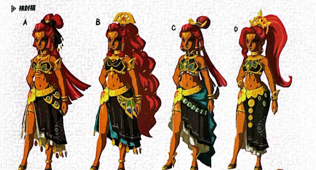
On her page, we get to see another 4 designs for her in Tears of the Kingdom, and they all look very different from the final one.
Since unlike the short haired look the final game got, these show her with more traditional Gerudo hairstyles. Or perhaps the same cut as Shantae.
As per before though, they were changed for practicality and lore sense. As the book points out, they wanted her outfit and hairstyle to be practical for combat purposes, and a short haired look fit the bill far better there.
So as interesting as the Shantae esque styles here were, they just had to go.
Mucktorok’s Alternate Forms
But enough about sages for now. Let’s talk about some of the early boss and enemy designs.
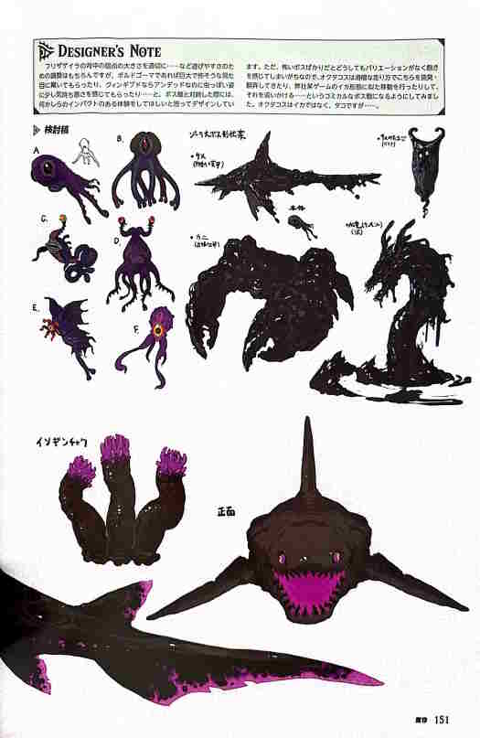
Like Mucktorok’s one. In the final game, he’s known for becoming a sludge shark when he attacks, with the goal of the battle being to knock him out of that form with Sidon’s ability.
But it seems like the creators of the game didn’t quite know what form of sea life he was going to be here. Why? Because not only is there artwork for him as a shark…
There’s also artwork for him as a crab, manta ray and sea serpent too! So, it seems the battle could have played out VERY differently here!
And that’s made even more true by his other artwork as well. There he’s shown as everything from a batlike creature to something resembling Bellum from Phantom Hourglass. Hence there’s a possibility that instead of bouncing and waddling when revealed, he was a bit more agile in that form instead.
Which makes us wonder; should they kept these forms, at least for the second half of the battle?
Because at the moment, Mucktorok is not a particularly fun boss fight. It’s tedious, it’s annoying, and the attacks it does are usually more irritating than they are dangerous.
So, imagine if he changed it up instead. Imagine if the second form had him go into the floor and pop out as a sea serpent, turning things from a chase sequence to a whack a mole one. Or imagine if he became a manta ray and could split into different forms or something, like a certain Super Mario Sunshine boss!
Oh, wait a minute. Splatoon 3 already did that one.

Never mind, next!
The Return of Puppet Ganon
Unfortunately, the other Regional Phenomena bosses are a bit less interesting than Mucktorok in terms of unused designs. Okay, Colgera has a few minor design differences, and Queen Gibdo was something akin to a centipede at one point…
But for the most part, the concepts for the bosses seem to have been decided very early on here. The creators clearly knew what they wanted the main story to be, and stuck with it.
However, there’s one other exception. The Seized Construct.
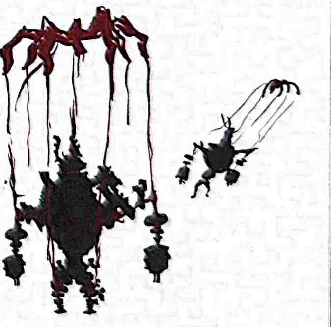
Since for whatever reason, we see an interesting unused concept for that boss showing it as a puppet too. This version is held up by strings in its forms, with another picture showing it being yanked into the sky between phases.
So perhaps at one point, this creature wasn’t always fought in a boxing match. Perhaps at one point, it worked more like Puppet Ganon from The Wind Waker. You’d fight it normally first, then it’d be pulled into the sky and redesigned for phase 2.
It’s a cool visual, and one which could have made for an interesting boss fight…
But to be honest, it’s great as it is too. Either concept would have worked fine in our book!
A Fire Breathing Flux Construct?
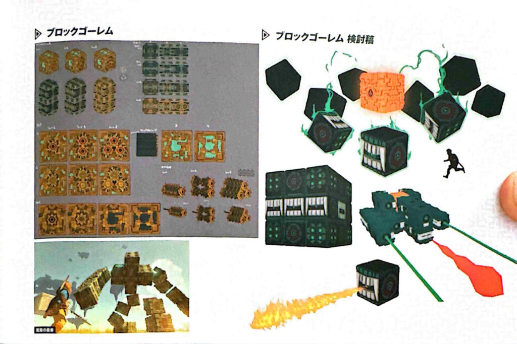
Speaking of Constructs, it seems the Flux Constructs had a few interesting attack concepts considered too. Namely, the ability to shoot fire.
Yep, there’s actually a concept for a Flux Construct form that turns into a tank, and shoots fire like Master Kohga’s robot does during his final fight:
It’s a really cool design, and with the two lasers + fire setup, reminds us of quite a few bosses from shoot em up games past.
So, it’s a shame it didn’t make the cut for the final game. Would have been amazing to see it as an alternate form of the level 2/3 versions, along with the spinning blocks form shown directly above it.
Skyview Stylings
Regardless, onto some locations now, since a few of them have interesting designs concepts too.
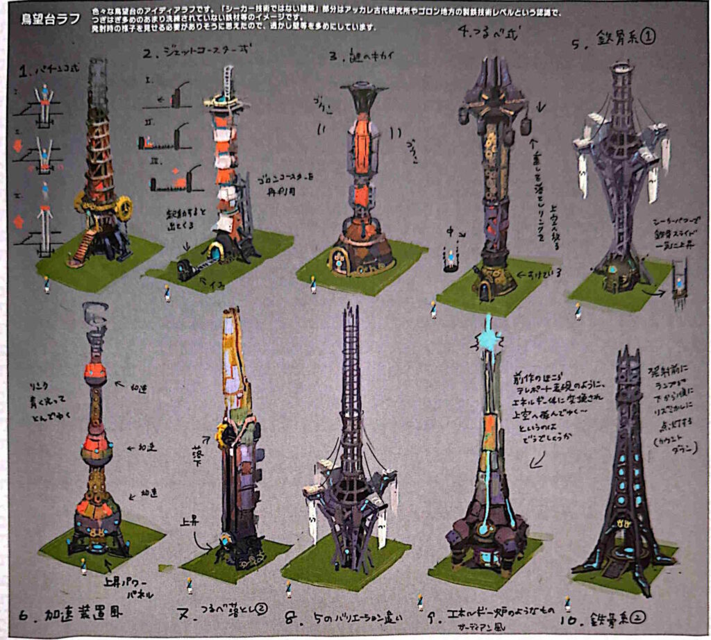
Like the Skyview Towers. While the final game’s versions have a very handcrafted cloth + metal construction, the other concepts take the idea in very different directions:
With many of them looking like something out a sci-fi film. You’ve got Guardian style base chambers, wacky fins and decorations, energy balls at the top…
Honestly, they’re all very bizarre to say the least. Stylish, but bizarre.
And it makes sense why they were changed. The final versions have a very… DIY style to them. They look like something you’d expect from a barely above medieval kingdom with a bit of advanced tech from ancient times.
Meanwhile these early concepts look like something from a cyberpunk Zelda game instead. Something that would probably fit in quite well with the modern day, not the Hyrule of Tears of the Kingdom.
Either way, let’s move on!
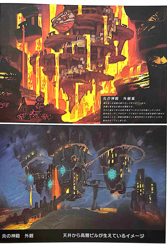
The Fire Temple
To the temples. Unlike the Divine Beasts, most of these don’t have alternate designs in Masterworks. The Lightning Temple is basically unchanged from the final game, the Spirit Temple concepts don’t show any indication of the unused design from in the game’s files, and the Water Temple is sadly identical to the final game too.
But there is one exception, and that’s the Fire Temple.
Put simply, the Fire Temple looked VERY different in some of these pieces. Unlike the final version, it looks like a truly ancient city hanging from the ceiling, with dozens of floors all designed in a spiral pattern. There are both an awesome looking one that mixes in parts of Rudania’s design motive, plus another one which makes it look like the buildings were carved into giant stalactites hanging from the Depths ceiling.
They’re amazing designs, and ones that look a lot more… unique than the one we actually got in the final game.
What’s more, they also seem like they’d fix a few design problems too. Namely, how 99% of players trivialise the original dungeon.
Since in these versions, the way they’re built into the rock would seemingly require you to do at least a bit of work to reach the terminals, rather than just rocketing up the side like in the final game.
Alas, it wasn’t to be. Here’s hoping these designs find a use in a future Zelda game instead!
Zonai Robot Wars
On a different note, we’ve also got a few interesting backstory details about the game’s world. How the Great Sky Island was the Zonai capital. How the Imprisoning War went down and how the forces navigated Hyrule. How the Zonai helped the various species build the temples for the Secret Stones.
Etc.
But we’re not talking about that this time.
Instead, we’re discussing the colosseums in the Depths.
And what they were actually used for. Put simply, they were used for robot combat!
Yup, the Zonai would occasionally make the Constructs fight each other, in a Hyrulean equivalent to Robot Wars or Battlebots. Pretty cool, eh?
The Tears of the Dragon
Regardless, onto another topic. One about the name of the game that we’re sure no one else has ever covered before.
The Legend of Zelda: Tears of the Dragon News Results
Ah never mind. Apparently, half the internet learnt about this fact while we were writing this article.
Still, the concept is interesting nonetheless. Put simply, the game was originally known as Tears of the Dragon, as a way to emphasise the whole ‘dragon’ theme the game had going.
It was a cool name, and it worked well.
But like the Light Dragon designs mentioned earlier, it ran into an issue with spoilers. Put simply, the devs didn’t want it to be too obvious that Zelda was the Light Dragon.
So, to avoid emphasising the Light Dragon too much (and potentially giving the story away), they changed it to Tears of the Kingdom instead. An equally cool name, and one without any spoilers included.
And hey, the dragon theme got kept for the logo, so that’s something!
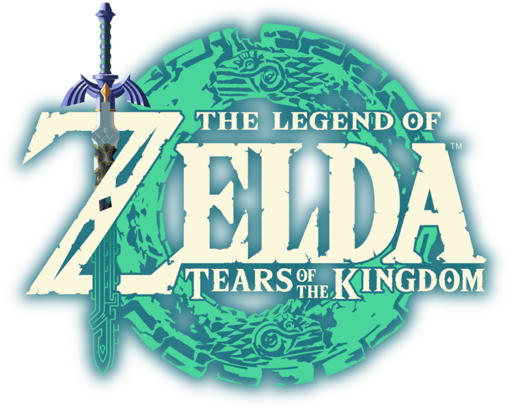
The final logo for Tears of the Kingdom has the circling dragon motifs
Ganon’s Design Changes
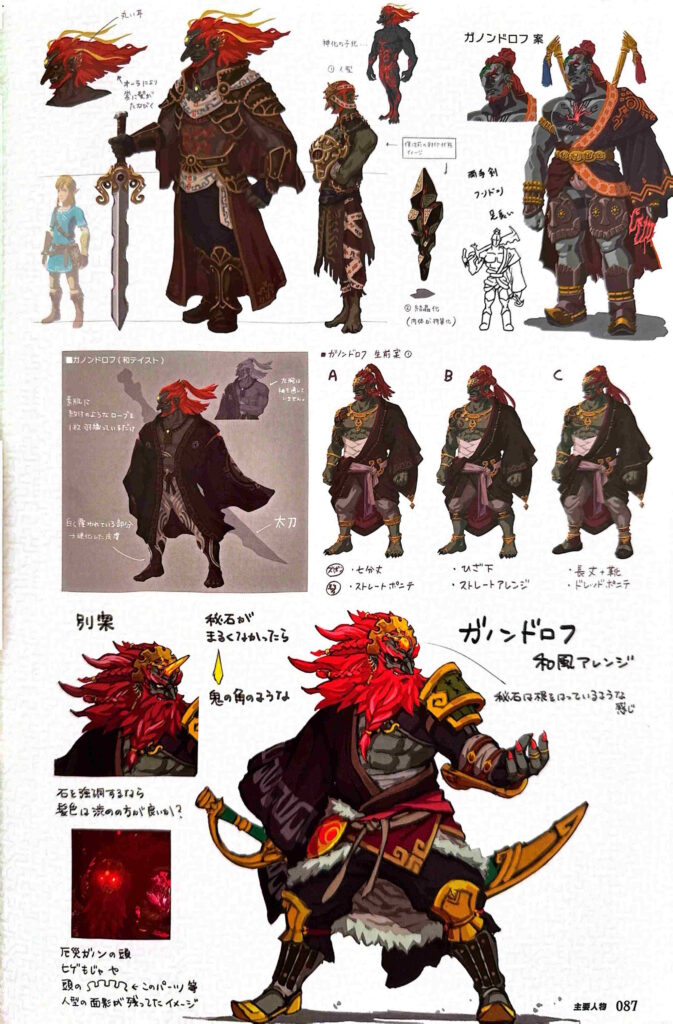
Still, let’s talk about Ganondorf now. His final design in Tears of the Kingdom is incredible, and perhaps one of his best visual appearances to date.
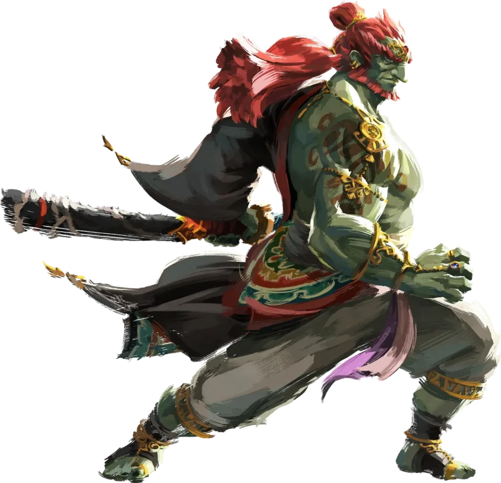
Ganondorf’s incredible artwork for Tears of the Kingdom
As it turns out though, the concept art for him is no slouch either. Why? Because the book shows dozens of unused concepts for Ganondorf’s look, all of which have their own charm. There’s one that looks a lot like Twilight Princess Ganondorf, a thinner one which looks like Ghirahim from Skyward Sword and a truly epic looking one which gives us serious Hyrule Warriors vibes:
They’re great designs, and while not as good as the final version, ones which we probably would have found equally amazing had they made the final game.
So yeah, Ganondorf looked epic in all his forms, and was always going to look incredible in this game!
A Different Demon Dragon
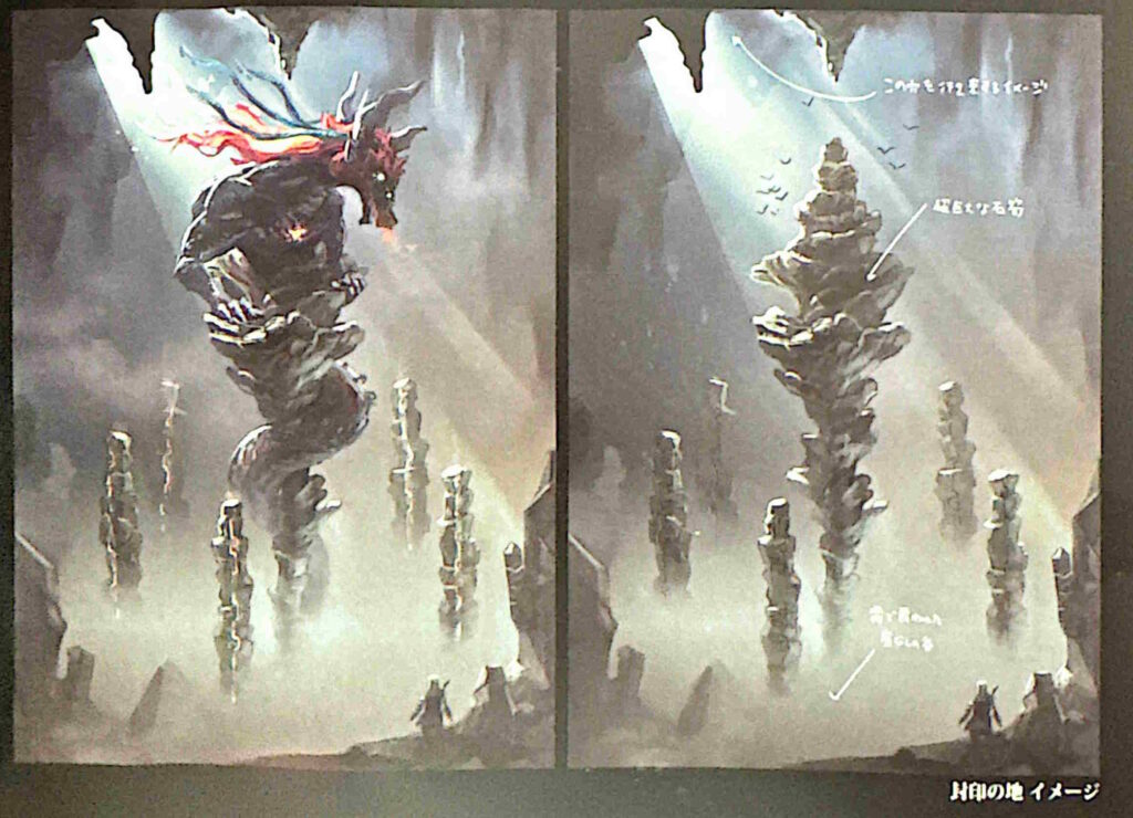
And speaking of Ganondorf, the Demon Dragon had a few interesting design changes too. Or more precisely, its size and choice of battle arena did.
Since Masterworks gives a few details about it that may make even the most dedicated fans shudder. Most notably, this piece here.
At first glance, it’s already kinda insane. You’ve got a battle with the dragon in what looks like the Depths, complete with it clinging on pillars and attacking Link. It’s a very different style of battle from the one we eventually got, and one which could have even been better depending on the implementation.
But it’s not interesting for its setup alone. No, it’s size is worth pointing out too.
Since as the developer notes say, this dragon isn’t the same as the one in the final game. No, it’s at least 3 times bigger.
That is truly mind boggling. In fact, let me show you a comparison made by the Zelda Lore channel owner on Discord.
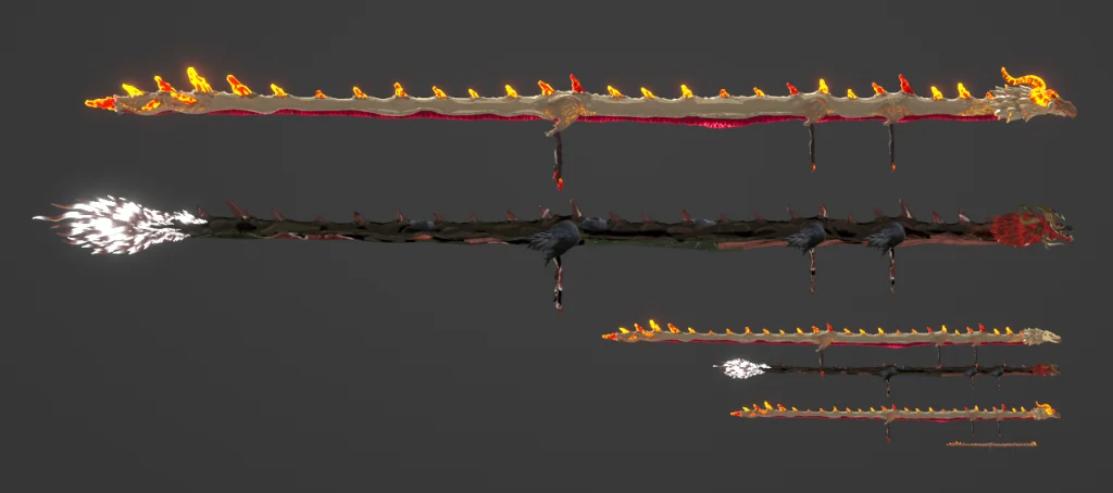
A size comparison between Dinraal, a Dinraal the size of the Demon Dragon, the Demon Dragon itself, a Dinraal the size of a Dark Skeleton and the Demon Dragon from the concept art
That bottom dragon? That’s Dinraal.
Then going up you’ve got Dinraal scaled up to the size of the Demon Dragon, and the Demon Dragon itself.
Then there’s Dinraal scaled up to the size of the Dark Skeletons found in the Depths.
And above THAT is the approximate size of the Demon Dragon in this picture. Seriously, it would have been dwarfed the Leviathans, made the likes of Megaleg or the Colossi look tiny, and put either Giant Bowser or Giant Luigi from the Mario & Luigi series to shame.
Yeah, it was enormous. Likely to the point we’re not sure how the game or engine would have handled it.
And that’s probably one major reason it was changed. Just imagine trying to fight something the size of a mountain. Just imagine trying to set up an arena in the Depths that allows this thing to function and doesn’t require it to sit still for the entire battle.
Just imagine trying to find a way to go from ‘epic Demon Dragon Depths Battle’ to saving Zelda as she falls to Earth.
It’s not easy, and it’s probably not quite as spectacular as the fight we got either. Hence the idea was changed, and we got two dragons circling above Hyrule instead
Still, those are just a few of the awesome unused ideas found in The Legend of Zelda: Tears of the Kingdom Master Works. There’s certainly a lot more where those came from, but we’re gonna leave those for future wiki articles and book readers instead. So, if you want to learn more about the game and its development, get that instead!
Either way, thanks to our friends on the Zelda YouTubers Discord for providing the information, thanks to Bradley from Zelda Lore for his translation work, and thanks to you guys for reading.
So what are your thoughts on these concepts? Do you prefer any of them to the final game? Or did Nintendo make the right decision with the ones they chose?
Leave your thoughts in the comments below, on social media, or over on our Discord server today!
